“Website Sundar Hai… Phir Bhi Log Buy Kyun Nahi Kar Rahe?”
Many ecommerce founders proudly say:
- “Website premium lagti hai”
- “Design bahut acha hai”
- “Homepage modern hai”
Yet the data tells a different story:
- High bounce rate
- Low product page visits
- Poor conversion rate
This leads to confusion: “Homepage toh sahi hai… problem ads mein hogi.”
Here’s the uncomfortable truth:
👉 Most ecommerce homepages don’t fail because they look bad. They fail because they don’t guide decisions.
In ecommerce, your homepage is not:
- A brand brochure
- A mood board
- A design showcase
👉 Your homepage is a decision-making page.
This blog breaks down the most common homepage mistakes that reduce ecommerce conversions, why they happen, and how Indian ecommerce brands can fix them in 2026.
Is your Homepage leaking revenue?
Get a professional audit to find out why users aren't buying.
- The 5-Second Rule: Why Homepages Matter So Much
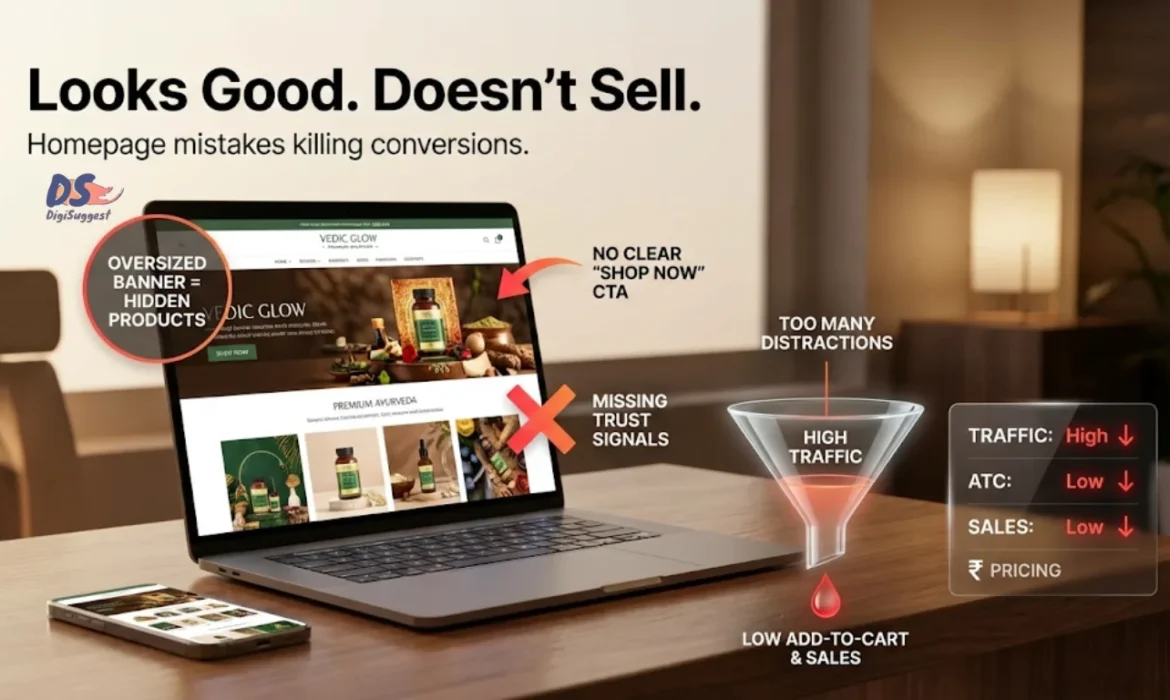
- Mistake 1️⃣ Your Hero Section Is Vague or Brand-Focused
- Mistake 2️⃣ No Clear Primary Call-to-Action (CTA)
- Mistake 3️⃣ Too Much Information Too Early
- Mistake 4️⃣ No Trust Signals Above the Fold
- Mistake 5️⃣ Homepage Talks About Brand, Not User Problems
- Mistake 6️⃣ Weak Navigation Structure
- Mistake 7️⃣ No Clear “Who Is This For?”
- Mistake 8️⃣ Over-Reliance on Discounts
- Mistake 9️⃣ Homepage Is Not Mobile-Optimized
- Mistake 🔟 No Clear Flow to Product Pages
- A Simple High-Converting Homepage Framework
- Why Homepage CRO Impacts Ads & SEO Performance
- How Digi Suggest Fixes Homepage Conversion Issues
- Final Thought
The 5-Second Rule: Why Homepages Matter So Much
When a user lands on your homepage, you have:
👉 5 seconds or less to answer three questions:
- What do you sell?
- Who is it for?
- Why should I trust you?
If your homepage doesn’t answer these immediately:
- Users scroll aimlessly
- Or bounce
- Or click randomly
None of these lead to conversions. This is often referred to as the 5-second test in marketing psychology.
Mistake 1️⃣ Your Hero Section Is Vague or Brand-Focused
This is the biggest homepage mistake. Most ecommerce hero sections show:
- Brand slogans
- Emotional taglines
- Lifestyle images
- Generic claims
Example: “Redefining wellness for modern India.”
Sounds nice. Converts nothing.
Why This Kills Conversions
New visitors:
- Don’t know your brand
- Don’t care about your mission yet
- Want clarity, not poetry
CRO Fix
Your hero section should clearly state:
- What you sell
- For whom
- The main benefit
Example: “Skincare products designed for Indian skin dermatologically tested, safe for daily use.”
👉 Clarity beats creativity on the homepage, especially for D2C brands.
Mistake 2️⃣ No Clear Primary Call-to-Action (CTA)
Many homepages have:
- Multiple CTAs
- Competing buttons
- Or no clear next step
Examples:
- “Explore”
- “Learn more”
- “Our story”
- “Shop collections”
- “Read blog”
This creates decision paralysis.
Why This Reduces Conversions
Users don’t want to decide what to do. They want guidance.
CRO Fix
- One primary CTA above the fold
- Clear, action-oriented text
- Secondary CTAs only after intent builds
Example:
“Shop Bestsellers”
“Find Your Perfect Product”
👉 One page = one main action.
Mistake 3️⃣ Too Much Information Too Early
Many ecommerce homepages try to show:
- All categories
- All products
- All features
- All certifications
- All blog content
This overwhelms users.
Why This Fails
Users landing on your homepage are:
- Cold
- Curious
- Not ready to process everything
Information overload causes:
- Skimming
- Confusion
- Exit
CRO Fix
- Progressive disclosure
- Show essentials first
- Deeper details later
👉 Homepage should invite exploration, not demand attention.
Mistake 4️⃣ No Trust Signals Above the Fold (Critical in India)
Indian ecommerce users are cautious.
If your homepage doesn’t show trust immediately, users assume: “Ye naya brand lag raha hai… risk hai.”
Common Missing Trust Signals
- Customer reviews
- Media mentions
- COD availability
- Return policy highlights
- Social proof numbers
CRO Fix
Add trust signals above or just below the fold:
- “Trusted by 50,000+ customers”
- ⭐⭐⭐⭐⭐ reviews
- COD & easy returns badges
- Delivery timeline clarity
👉 In India, trust precedes interest.
Build Trust & Increase Sales
We help you optimize for the Indian consumer mindset.
Mistake 5️⃣ Homepage Talks About Brand, Not User Problems
Many homepages focus on:
- Brand story
- Vision & mission
- Founder philosophy
This content has value but not upfront.
Why This Hurts Conversions
New users think: “This brand is talking about itself, not me.”
CRO Fix
Flip the narrative:
- Start with user pain
- Then introduce the brand as the solution
Example:
❌ “We started this brand to change the industry”
✅ “Tired of products that don’t work for Indian conditions?”
👉 Make the user the hero, not the brand.
Mistake 6️⃣ Weak Navigation Structure
Navigation Structure is often ignored in CRO discussions.
Common issues:
- Too many menu items
- Confusing category names
- Hidden bestsellers
- No logical flow
Why This Reduces Conversions
If users can’t quickly find:
- What they’re looking for
- Or where to start
They leave.
CRO Fix
- Simple category structure
- Highlight bestsellers
- Logical grouping
- Clear labels
👉 Navigation should reduce thinking, not add it.
Mistake 7️⃣ No Clear “Who Is This For?”
Many ecommerce homepages fail to clarify:
- Target audience
- Use cases
- Scenarios
This causes users to wonder: “Is this meant for someone like me?”
CRO Fix
Use segmentation:
- “For dry skin”
- “For beginners”
- “For daily use”
- “For fitness beginners”
This helps users self-identify quickly.
👉 Relevance increases conversions.
Mistake 8️⃣ Over-Reliance on Discounts
Some homepages lead with:
- Flat discounts
- Big offers
- Sale banners
This attracts:
- Price-only buyers
- Low loyalty users
And hurts:
- Brand perception
- Long-term conversions, as discount-only marketing kills brand value.
CRO Fix
- Lead with value
- Support with offers
- Don’t make discounts your identity
👉 Trust + value convert better than price alone.
Mistake 9️⃣ Homepage Is Not Mobile-Optimized
In India, most ecommerce traffic is mobile.
Common mobile homepage issues:
- Long loading time
- Huge banners
- Tiny text
- Difficult navigation
- Too much scrolling
CRO Fix
- Design mobile-first
- Short sections
- Clear CTAs
- Fast load speed (Focus on Core Web Vitals)
👉 If your homepage fails on mobile, it fails overall.
Mistake 🔟 No Clear Flow to Product Pages
Many homepages fail to push users toward product pages. They:
- Distract with content
- Promote too many sections
- Forget the core goal
CRO Fix
Your homepage flow should be:
Hero → Trust → Categories → Bestsellers → Proof → CTA
👉 Every section should move users closer to products.
A Simple High-Converting Homepage Framework
Here’s a structure that works for most ecommerce brands:
- Clear hero section (what + who + benefit)
- Primary CTA (shop / explore)
- Trust signals
- Bestsellers or categories
- Benefits & differentiators
- Social proof
- Reassurance (delivery, returns)
Simple. Focused. Effective.
Why Homepage CRO Impacts Ads & SEO Performance
If your homepage:
- Confuses users
- Lacks clarity
- Doesn’t build trust
Then:
- Ad traffic wastes money
- SEO traffic bounces
- Overall CPA increases
👉 Homepage CRO multiplies the ROI of every channel.
How Digi Suggest Fixes Homepage Conversion Issues
At Digi Suggest, we don’t redesign homepages blindly. We diagnose:
- User behavior
- Funnel flow
- Trust gaps
- Clarity issues
Our Homepage CRO Approach
- Heatmap & behavior analysis
- Above-the-fold clarity fixes
- Trust & reassurance optimization
- Mobile-first improvements
- Funnel-aligned layout changes
🎯 The goal is not “better design”.
🎯 The goal is more conversions from the same traffic.
This is why most websites don't rank or sell as they miss the basics of user experience.
Homepage Getting Traffic but Not Sales?
Book a free homepage CRO audit and uncover what’s stopping conversions.
Final Thought
A good-looking homepage doesn’t guarantee sales. A clear, trust-building homepage does.
If your homepage:
- Confuses users
- Hides value
- Lacks trust
No amount of ads will save it. Before scaling traffic fix your homepage.
FAQs
In 2026, the homepage sets trust and clarity within the first 5 seconds. If users don’t immediately understand the product and value, they exit.
Homepages should focus on clarity and guidance first. Branding supports conversions but should not replace clear product messaging.
The biggest mistake is vague hero messaging that talks about the brand instead of clearly explaining what the user can buy and why it matters.
Yes. Reviews, COD availability, delivery timelines, and return policies significantly improve homepage conversions in India.
Homepages should be reviewed quarterly or whenever traffic sources, product focus, or user behavior changes.